

I rolled around for quite a while how I wanted to approach this topic when the team here suggested Color Theory as a the subject of my next article.This brought me to the decision that I would do this in a two part series. There are sooooo many ways to approach color selection for your models, some overly scientific, talking about color theory and whatnot, and some that simply just say go with what feels right, that it is difficult to write an article that will strike a chord with all readers. So instead of going into the complicated science of color theory in this first part, setting aside discussions of complimentary and contrasting colors for the next installment, I am going to talk about two or three things that are overall decisions that need to be made that will affect your color choices. First and foremost is Tone. To me this is the most important decision from the beginning. Is your model going to be bright and flashy, commanding the eye to float to it, picking it out of a crowd? Or is it going to be subdued, muted, designed to blend in to the rest. This idea will dictate your color choices, more importantly it will dictate how much contrast you are going to add to a model.
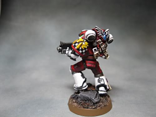
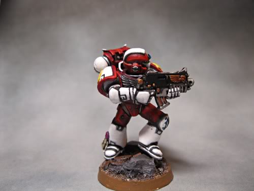 This Marine represents the first category I was talking about above. He screams out, based on the color tone, “look at me! Here I am!” Color choices for this tone of model are going to be bolder, contrasting colors are going to be more dramatic and more prevalent.
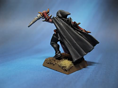
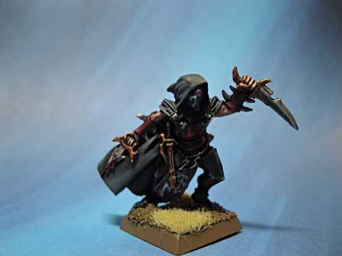 This Dark Elf Assassin is an example of the second category I was talking about. The tone of the models is more muted, contrasting colors less bold and less prevalent. This brings me to the most important aspect of color selection….. Contrast. Now, this is the point of the dissertation where most writers would talk about the science of color theory, but again I am leaving that for the next installment of the article. I believe that multiple factors go into the selection of color than just the knowledge of complementary and contrasting colors on a color wheel. I want to focus on the more personal factors that apply to color selection and how you can incorporate your personal tastes, or the personal tastes of your client of you are commission painting, into the model to provide that all important contrast. When I talk about contrast I am really talking about adding areas to the model that lead your eye around the model as a whole, that break up large areas of one color, that keep your model from being one mass of blue, red, purple, green, or what ever.
It is important, whether you have selected a muted tone or a vibrant tone, to find those areas on the model that are going to be spot colors, and add them to your mental checklist as areas that need a contrasting color selection. I have found it useful in the past, as I was just beginning to really dive into more complicated projects, to grab a piece of watercolor paper and just grab colors that I liked, that I thought might work well together for the model that I was working on, and start putting them together in groups on that big piece of paper. I would set the model at the head of my table and just start throwing groups of colors that I wanted to use together, toying with what would work, and visualizing where those colors would fit on the model. This step really got me comfortable with the model and it allowed me to try some amazing combinations that would not have traditionally gone together, but really worked with the model that I was working with.
It is my fervent opinion that your art is an extension of your own desires and feelings and that can still apply to miniatures. If you like a color, play with it, find out if it works with your model and with your tastes, regardless if it falls appropriately on the color wheel.
So to recap, for this segment, the big decision you need to make is the TONE of your model: Vibrant or Muted. After that decision is made you need to take just a moment to decide where your CONTRASTing elements are going to fit. It really boils down that model to its basics, then play. Find a test model, or throw down a large sheet of watercolor paper and just start experimenting with things that you like. In the next segment of this article, which will be on next Wednesday, I will dive into the science of color theory. We will talk about the color wheel, complementary and contrasting colors, and we will really start to dissect “advanced” color choice.